the brief
Creation of a webzine with design as its central theme and production of all its related aspects: digital identity, layouts, information architecture, wireframing, user interface, prototyping and social media management.
the PROCESS
The starting point which spurred the concept creation was the quarantine time borugh about by the global pandemic in March 2020, that forced people to work from home.
Designers, like everyone else, had to learn how to deal with this particular condition, that brought about big changes in their daily job tasks.
areas of focus
⬩ Creative Process
⬩ Relationships with Collegues
⬩ Self-confidence and Work-life Balance
⬩ Future of Design
⬩ Relationships with Collegues
⬩ Self-confidence and Work-life Balance
⬩ Future of Design
Four design students from different fields (communication, interior, product and fashion) were interviewed on the topic of remote working through the perspective of the four macro areas of focus, as a starting point for the webzine's contents.

the CONCEPT
With SmartUorchi, the goal is to create a repository where it is possible to share useful experiences, tools, tips and materials that can help designers to have a better approach to Remote Working (known also as Smart Working).
the structure
The contents of the student's responses, revised and organized, are then proposed in the Webzine through the three main sections of the website:
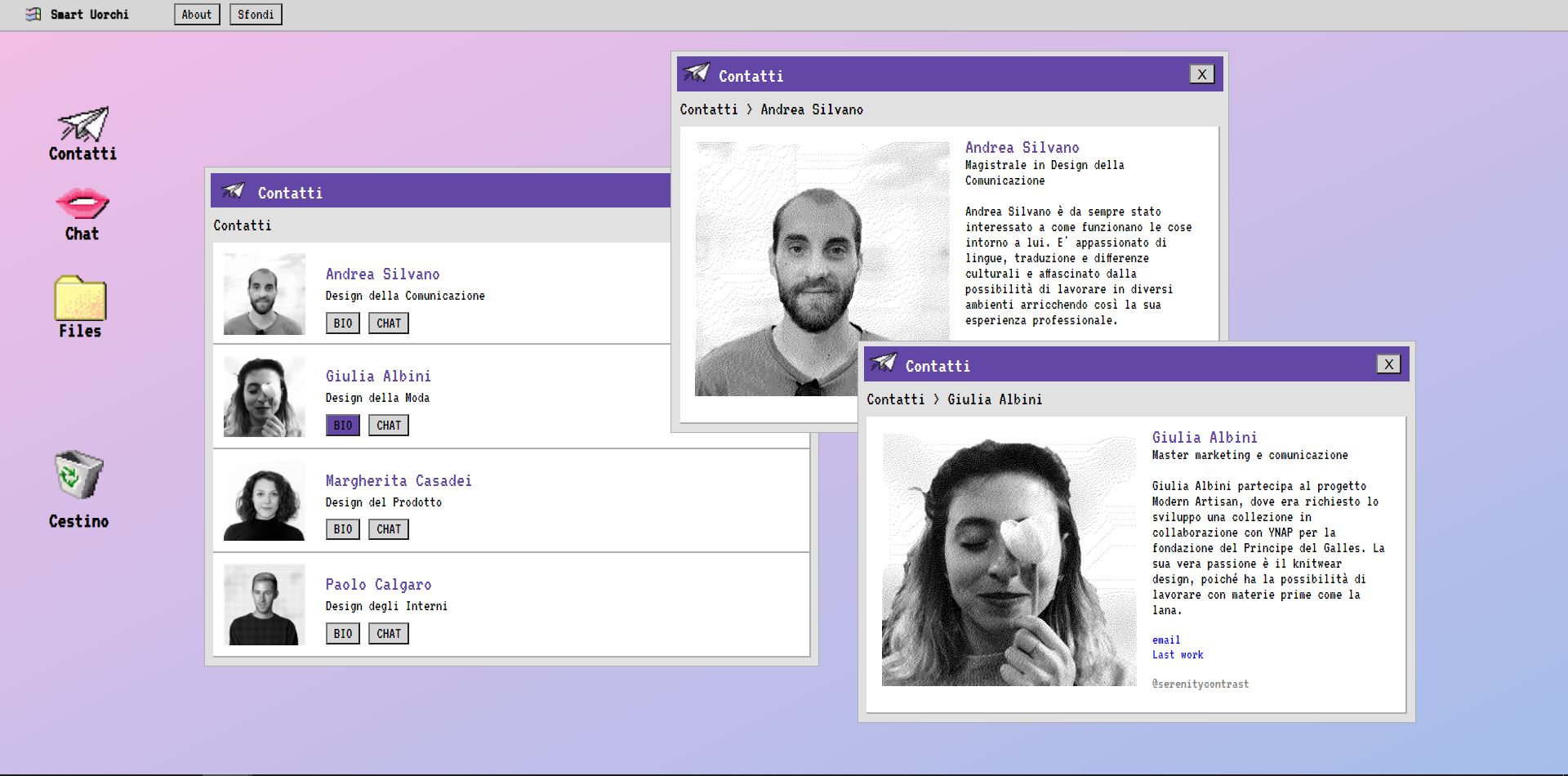
01 | Contacts
Short bios and general information about the interviewees
02 | chat
Interactive bot, that the user can explore freely, with videos, images and links
03 | files
List of all the mentioned tools with direct links to websites to purchase them


tone of voice and visual identity
The underlying tone of voice for Smart Uorchi, that relates to all the aspects of the project, is ironic, fun and informal.
The visuals have, as reference, the iconic Windows 95 UI. The overall mood and the color palette revolve around a nostalgia-based theme, which brings back, with a modern and fresh touch the familiar interface.
For the mobile version, instead, to always stay on the lines as the desktop version, the famous Nokia 3310 and its original green background was used as main aesthetic direction.


social media strategy
Regarding the visuals, the social media activities related to the project reflected the original style and dynamic content.
This was also translated in a content creation strategy that could always keep the engagement and the entertainment high, mainly for Instagram. It was chosen as it is the main platform through which reach the target audience (designers, of all ages) and have a constant and direct connection with them.
Different types of content were defined and produced: an ad hoc design podcast, fun and relatable memes, quizzes through stories and more information tidbits.


